
Endangered Species - Government Agency Redesign
Team:
Carolina Silva, Justin Wong
Duration:
4 weeks
Role:
User Research, Visual Design, Wireframing, Prototyping
Task:
Take on the role of a visual designer who wants to understand how people use the government agency navigation and website content so that you can wireframe, design, prototype, and test a new website solution for desktop.
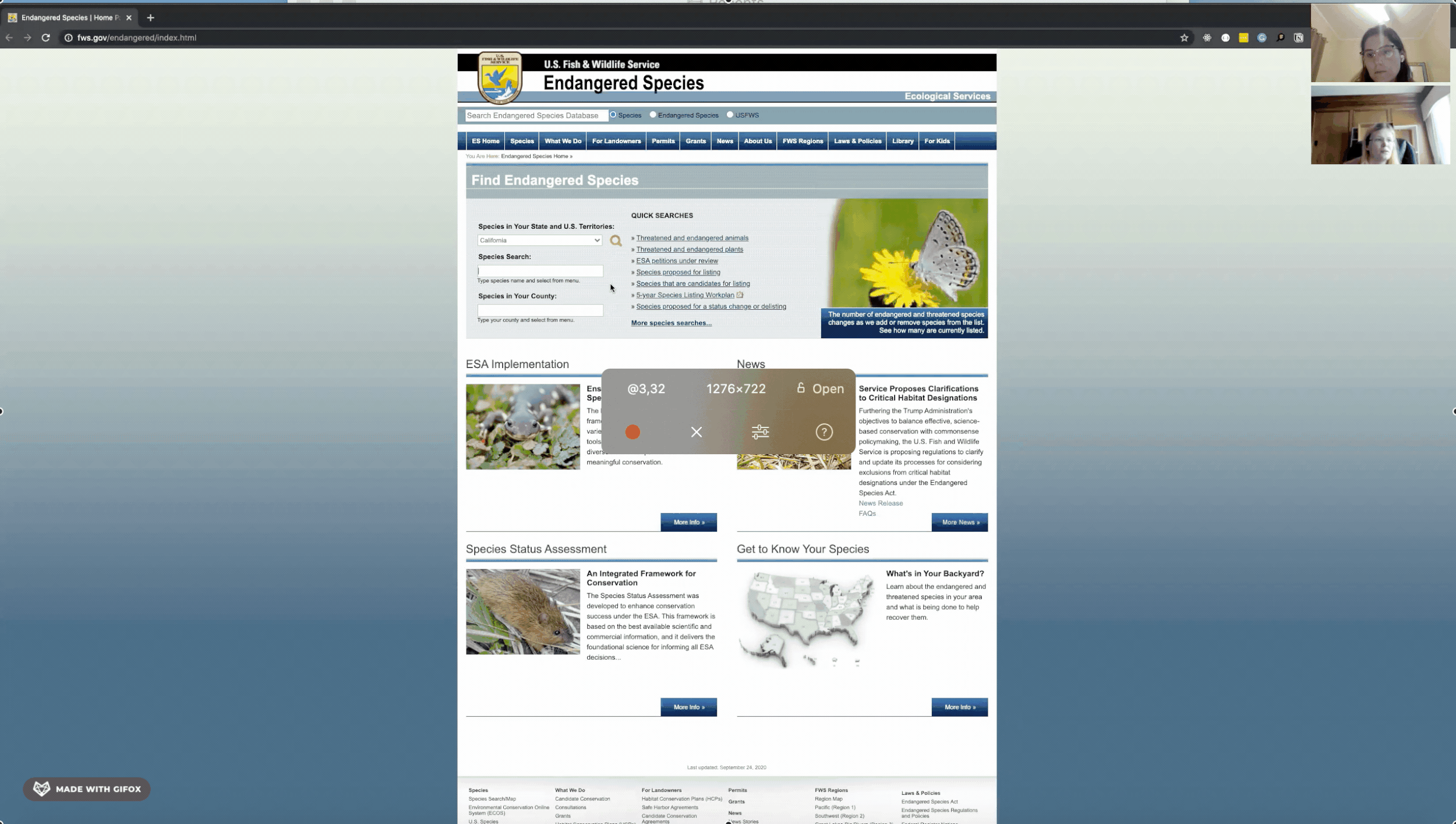
What is the Endangered Species Agency?
As the principal federal partner responsible for administering the Endangered Species Act (ESA), the agency takes the lead in recovering and conserving United States’ imperilled species by fostering partnerships, employing scientific excellence, and developing a workforce of conservation leaders.
As they work in partnership with others, their two major goals are:
Protect endangered and threatened species, and then pursue their recovery;
Conserve candidate species and species-at-risk so that listing under the ESA is not necessary.
Problem: The Endangered Species Program website provides an overabundance of information and a confusion navigation system when perusing its vast database. The site’s drab color palette deters incoming visitors from exploring and the site lacks Responsive Web Design.
Project’s goals: Redesign the website for a more streamlined and visually pleasing experience for both potential program adoptees and information gatherers.
01
RESEARCH
We were tasked to create our own brief for this project and after careful observation and research of the Endangered Species website, we identified several opportunities to enhance the user experience.
USER INTERVIEWS | USABILITY TESTING
The team started the research process by conducting user interviews and usability testing with five users to identify pain points with the site navigation and readability issues.
During the usability test, users were asked to verbalize their thoughts and they were also asked to perform the following tasks:
Discover program information and enrolment
Find information page of certain species
Find multiple images of species
AFFINITY MAP
Their responses were recorded and summarised through an Affinity Map. We categorized the findings into clusters to help us identify and understand important ideas we needed to prioritize on moving forward.

2x2 PRIORITIZATION MATRIX
Subsequently, we prioritized the pain points based on their importance to a user as well as to the Government Agency by using 2x2 Priorization Matrix.
Based on the project timeline, we decided to focus on improving the website specifically based on those insights from the users:
Large blocks of text and links inhabit every page confusing users with path choices
Performing a species search through their filters is a complex and counterintuitive process
Search filters and menus for image search frustrated users as they had to relearn an outdated system and navigation pattern
“For Kids” sections deemed unsuitable for young audience and search features seemed archaic

USER PERSONAS
From our affinity map, we created user personas that best represented our future audience. Collecting the data together and converging key ideas allowed each persona to have unique problems that our design would solve.

02
Ideation & Development
With our objectives in mind, we began ideation solutions to our design challenge. Through generative design exercises, daily meetings, and exploration of past precedents, we created a number of concepts to consider.
CARD SORTING
Taking our user flows and transforming them into their first iterations of screens starting with basic sketches. To get to these sketches we conducted a card sorting to see what content and screens should be feature in the app that didn’t already stem from our user flows.

WIREFRAMES
We created lo-fidelity prototypes on Figma adding the steps from the user flows to corresponding screens. This got us thinking about which buttons we would place, if there would be images on the page, how much text did we ultimately want to add.
Moving on to our wireframes, we were able to further plan details like spacing and began to think of iconography or shapes that would fit best within the design.

03
Design & Prototyping
As we move to Sketch, we take our chances from our user testing and apply design techniques including but not limited to. color theory, spacing guidelines, OS guidelines, typography and images.
The core theme of nature and the outdoors along with a professional look were kept intact.

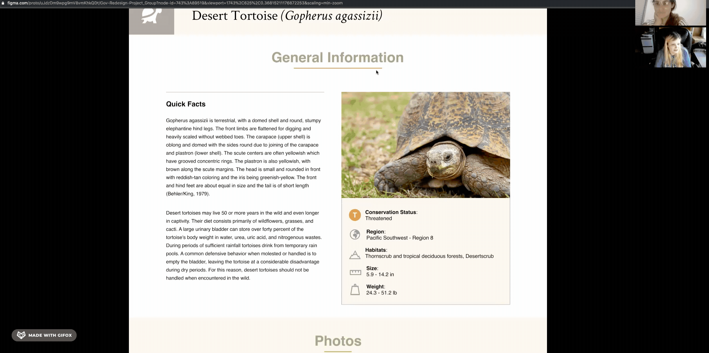
HIGH-FIDELITY PROTOTYPE

FIVE SECOND TESTING
After finishing the lo-fidelity prototypes, we conducted the Five Second Testing to uncover users’ initial impressions upon the homepage.
General user reactions:
Understood the purpose and function of the page
Felt items were appropriately placed in layout (intuitive and clean)
Most users focused on the items within the header for instructional cues and informations
04
Final Thoughts
TAKEAWAYS
Accessibility is a key feature that can not be ignored when designing. Ease of use and readability enhance the viewing experience and invite users to explore the site.
Responsive Web Design is of paramount importance when looking towards the future. Considerations need to be taken for the increased use of smartphones and mobile devices in a busier and more travel-friendly future.
Work remotely was a challenge. While building this app, my partner, Justin Wong, was in United States and I was in Brazil. Despite the time differences and work schedules, we learned to manage our time, manage our tasks, and follow up with each other every single day to keep the project moving. It was important to have clear deadlines for every single task. Justin and I collaborated effectively and we learned to be productive during those 4 weeks.
NEXT STEPS
Simple animations to the hero image portion of the “For Kids” page would have made for a more inviting and engaging viewing experience for children.
Investigate how to further reduce confusion when navigating to sister sites for media or species information.