
The Food Pantry - Nonprofit Redesign
Team:
Carolina Silva, Ryan Blackwell, Aneri Pothiwala, Shahane Bakunts
Duration:
2 weeks
Tools:
Miro, Figma, Figma Mirror, InVision
Task:
Our goal is to redesign a RWD website prototype for a local nonprofit that needs the most help with their UI design.
What is the The Food Pantry?
Our nonprofit redesign focused on The Food Pantry, a San Francisco food bank which has been operating for over 20 years. We had a lot of trouble finding a non profit we could communicate with spending days on the selection process but knew we had landed on the right project when talking to Michael Reid, The Food Pantry Operations Director. Feeding over 500 families a week through the years and even during the unique challenges Covid-19 presented.
When interviewing Michael, we identified his feelings on the website, with him stating it’s not the greatest and that the group needs $20,000 a year at minimum to handle operations. The site as currently constructed is more of a blog. Michael also stated the website was used mostly to take donations and that the group had been having trouble attracting volunteers during Covid-19.

Problem: The Food Pantry’s main mission is to feed hungry people and empower them to help each other. We learned that the organization has been having a hard time finding volunteers, attracting donors and informing families in need.
Project’s goals: Improve the quality of the website by building on functionality and enhancing the visuals to serve the community.
01
RESEARCH
OVERVIEW
As a researchers, we want to understand the way the new users find out about the website and how they go about using it to donate to The Food Pantry. We also want to understand how people in need can utilize the website to accept donations.
SURVEYS AND INTERVIEWS
We started our research by analyzing the current website. We conducted a survey, 5 second tests and user interviews. While our participation wasn’t as strong as we hoped we did gain some valuable insight. Most people were willing to volunteer and donate but didn’t know where to turn. Survey responders found out about charities from multiple sources but must agree with the group’s mission and trust the charity. The website plays a large part in building that trust.
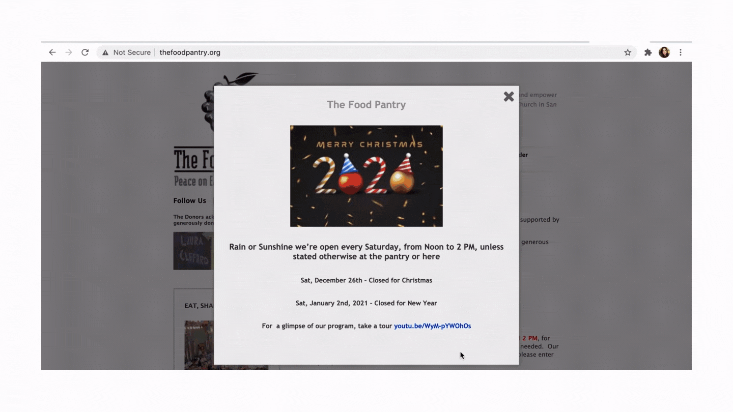
The current The Food Pantry page is constructed more like a blog than a contemporary webpage. When tested users complained about multiple issues that include, but are not limited to:
No clear donation button
The menu bar being too small
The mission statement not being visible
Navigation issues
No color pattern
An information pop-up screen on every page that is infuriating
PERSONA
After learning more about our charity and our users we created a user persona for the Sakharov family.

02
UI Design
SITEMAP
After a lengthy process of ideation in which we decided on key components of the website through methods like I Like/I Wish/What if and Card Sorting we devised a new sitemap. Our new webpage would be simpler in construction with a simplified section tab and dedicated volunteer and donate buttons. Our footer would have 3 key components including a secondary contact link.

WIREFRAMES
We laid out our sections and sketched our pages digitally with some low fidelity prototypes. All of our group members had a hand in designing the homepage with each individual member being responsible for other pages. We all came together everyday to unify the design.

In order to make a responsive product for The Food Pantry we also created a mobile version of the website with roughly the same collaborative process. Coming together to make key design decisions on the mobile homepage followed by building individual pages.

03
Design & Prototyping
We began the process of designing hi fidelity pages by creating a style tile and guide for usage that the group could follow. We labored over every small detail from color to brand logo for days before placing the final elements. We decided in the end that we would hold true to the colors presented in the users logo. We enhanced the green apple of the logo with a complementary purple found in onions for buttons and hi lights. A tertiary light tan reflected the hundreds of paper bags of food given to the community.

FINAL DESIGN


04
Future Considerations
In conclusion during our interview with shareholders we found out a lot of the community members who The Food Pantry serves are Russian and Spanish speakers and we would like to implement those translated languages.
We would also like to show the page redesign to the shareholders to collaborate and share any redesign through the Pantry’s social media.
Implementing a feedback and reviews page is another idea we played with for the future.
Through this case study project, I have learned not to let my own biases and presumptions affect my design decision. As a designer, it is very easy to assume we know what is best for the product and users, therefore I have to constantly remind myself that I am not designing to myself but to the users.