IBM - Cemig Kiosk Stations Redesign
⚡️ This is the story of how I made a positive impact on everyday life in Minas Gerais, Brazil
⚡️ To comply with my non-disclosure agreement, I have omitted and obfuscated confidential information in this case study
Overview
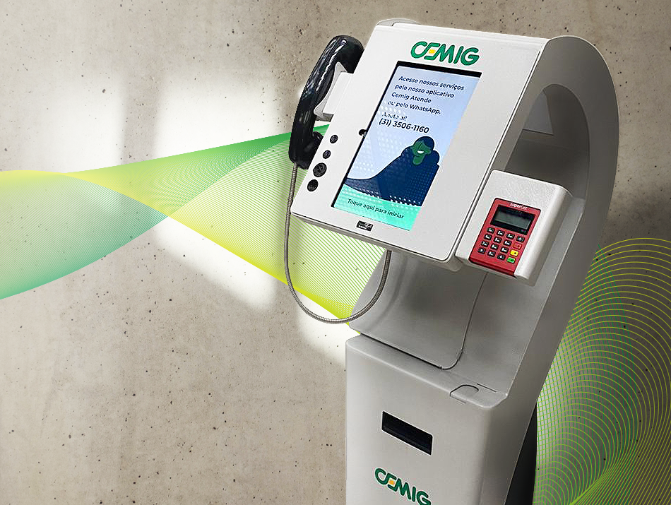
After extensive quantitative and qualitative research and a better understanding of the Cemig ecosystem - one of the largest power generators and distributors in Brazil - with key stakeholders, we embarked on a 1-year redesign of the kiosk stations to transition customer interaction over a digital and self-service channel to help with its digital transformation of customer care approach.
Within one year, Cemig relaunched 20 new features across 800+ kiosk stations for over 8.6 million customers. I was the leading designer working on these new features with a team of one more designer, a product manager, and five engineers.

The problem
By looking at the individual user journeys and flows, we uncovered issues where users were wrongfully converting, getting lost in the kiosk experience, and abandoning at a rate of 1,140 users per month (a 24% loss). Because the user’s experience of the application was slow, overwhelming, and complex, there were long lines at the various kiosk locations, and users needed help from employees to resolve the issues.
Goals
Users: Autonomy over their account with Cemig whenever they want
Business: Increase engagement and retention of customers
Product: Ensure reliability and consistent innovation

We observed that the kiosk’s users were potential beginners, unfamiliar with the technology. Thus, if they did not understand the first screens and our home, we had already lost them as customers because “you never get a second chance to make a first impression”.
We knew an immediate win for the Cemig kiosk solution would be relooked at the screensaver and onboarding, which meant redesigning them with a lightweight/welcoming instructional video and an appealing home.
Besides that, the most challenging part about redesigning these 20 features was translating and modifying complex flows and structural information with technical terms into visual forms that are appealing for the users, and addressing all potential error states and edge cases that can occur during each functionality. We used concise and clear visuals to help them understand what was happening at each step and to guide them to resolve any errors.
Research
We shadowed and interviewed people using the kiosk stations for the first time to understand and learn their pain points. We visited many of the Cemig agencies ourselves to observe foot traffic and analyze what it’s like to be in the shoes of first-time users.
Research findings
Issue with contrast
Frustrated and felt unsure of what to do first due to the missing hierarchy
Hesitation to try out, due to the overabundance of information and the unnecessary elements
Screens seemed unresponsive
Pressure to understand the system right away
Overwhelmed by the length of the overall process
Evaluating the experience
We assembled a team with professionals from adjacent areas to the design to perform possible real-life user tasks. As the items are evaluated, the team members assign scores based on principles and best usability practices. With results from our heuristics analysis, we reached the following radar chart, with the average of the evaluator’s scores:
At the end, we have percentages from each evaluator, meaning how much the kiosk meets those usability criteria, divided by categories. It is possible to observe that the most critical categories of the kiosk screens were:
Aesthetic and minimalist design
User control and freedom
Recognition rather than recall
Flexibility and efficiency of use
First deliverable
We shared our research findings and opportunities areas, as well as wireframes, mocks, and a heuristics analysis to Cemig stakeholders. The presentation culminate in two potential kiosk station customers and what a new onboarding experience onto Cemig kiosk stations could look like.
Customers
Personas and Journey Maps are small to omit confidential information
We observed that our main customers live in a rural area or are unfamiliar with technology in general. Most of them feel frustrated that they can't use their mobile phone to solve problems due to the limited, inconsistent, and sporadic network coverage or lack of device storage to download apps. With that in mind, the kiosk stations would be a great solution to their needs.
We used personas constantly throughout the project to guide design decisions, priorities, and create empathy amongst the client and our team.
Onboarding


How it works
Feature design and development were broken into parallel workstreams for the channels mobile, website, and kiosk. I led the design for all aspects related to the kiosk stations solution.
Each feature phase of the kiosk was serialized in a 2-week sprint, starting with the design and development of APIs for the functionalities chosen. I followed by working with my team and the client’s experts to translate product features for the kiosk context into user flows (detailed conversion flow audits helped identify areas where the experience could be reduced and simplified) whilst working with user story mapping and gathering requirements with my platform engineering team to execute the current features through to completion.
Once each feature of the sprint was designed and approved by the key stakeholders, the engineering team began the implementation in another 2-week sprint. Concurrently, I would design the next functionalities and features in the pipeline.

Working backwards from a fixed launch date meant that design was subsumed into an engineering‐driven process. The kiosk station solution was driven by engineering estimates and the time to create the right design was the time left over. The combination of a fixed launch date and aggressive scope created an intense environment with many coordination and time challenges.
Build for customers on the go
We developed a functionality called ‘Pagar conta’ (Pay bills). We simplified the process by minimizing the extra taps needed to accomplish the end goal, and at the same time, we implemented many payment options for users. The feedback we received from users was extremely positive, with many noting the convenience of having many payment options available, increasing the conversion rate by 40%.
Results
It’s still early days for the service, yet the results have exceeded our expectations. Since the launch of the redesign of the Kiosk Stations, the median number of active customers has increased by 68%.
Increased ‘Pagar conta’ (pay bills) functionality retention by 42%
Increased overall functionalities retention by 52%
Lines in the agency decreased in 31%
Takeaway
Spend more time with engineers! I learned that I should always build meaningful relationships with them that are more than just transactional. So I find ways to include them in the design process, I listen to their feedback and I learn how they build products. I realized that understanding the complexity and time it takes to implement my designs is extremely important. Why? A healthy relationship with the engineers always leads to stronger products and better craftsmanship. And besides that, they are a great source of innovation.